This blog post is not an accusation of misconduct, and reflects my personal opinion.
This paper has it all. The authors are from Stanford University’s School of Medicine and Harvard Medical School. It was published in 2002 in Nature Medicine, and has been cited over 900 times, as per Google Scholar. It even received a prestigious F1000 Recommendation. And it was supported by six NIH grants.
Akbari O et al. Antigen-specific regulatory T cells develop via the ICOS–ICOS-ligand pathway and inhibit allergen-induced airway hyperreactivity. Nature Medicine 8(9), September 2002. DOI: 10.1038/nm745.

But all that glitters is not gold. Let’s take a look at some of the flow cytometry images in this paper.
Figure 2 appears to have some unexpected repetitive patterns. The mice in the left panels got sprayed with Ovalbumin in their noses to induce an allergic reaction. The mice in the right panels received only PBS (control experiment). But unexpectedly, some groups of cells, marked by me in pink, lime green, light orange, and red, appear to be visible multiple times within the same panel or across panels.
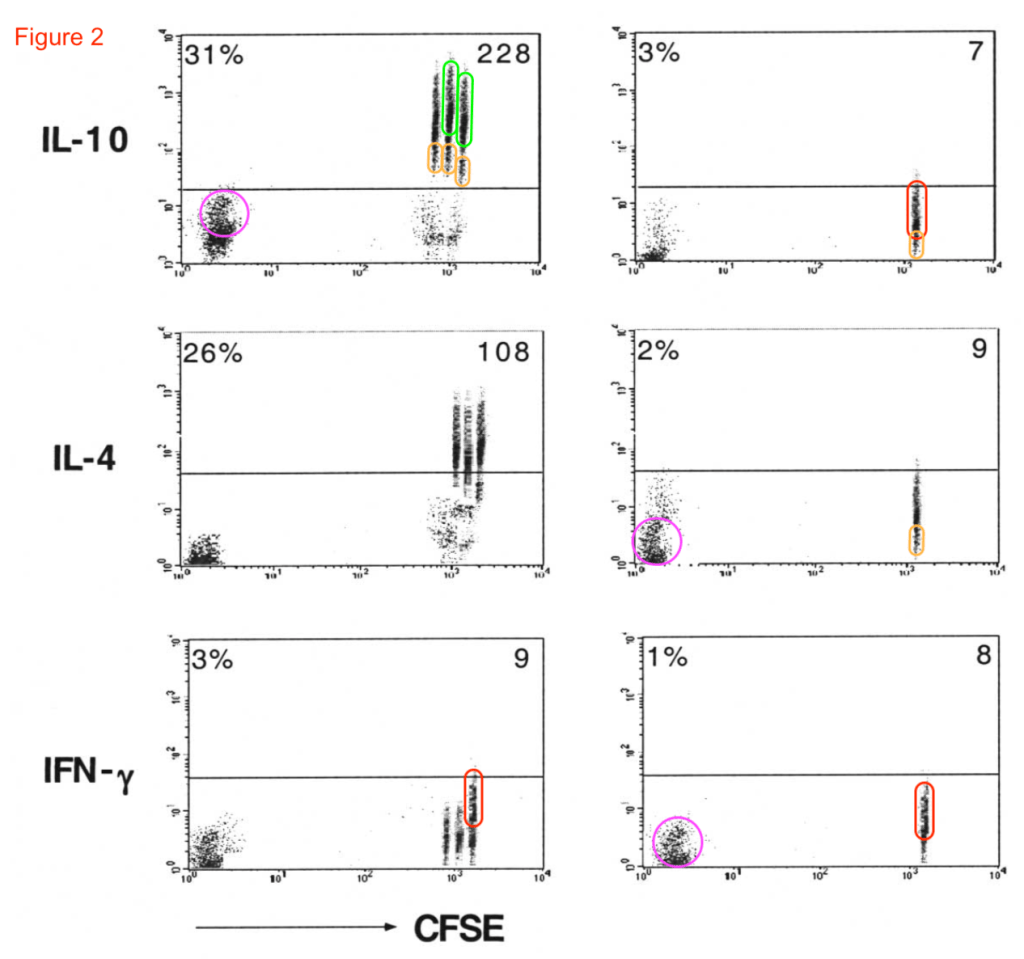
Several Flow Cytometry experts assured me that this is very unusual. Even if you would run the same samples again in the same machine, you would expect to measure dots at slightly different positions. The overall distribution (the “clouds”) might look similar, but the individual data points (called “events”) would be in a different configuration. It would be comparable to tossing sugar repetively on the floor; the grains will end up at different spots, even if you throw the exact same amount of grains at the same force, in the same direction.
So it is scientifically correct to be raise concerns about flow cytometry plots with putative repeating groups of events. Some folks on Twitter even called this phenomenon Flaw Cytometry (coined by Kevin Vervier) or Faux Cytometry (by Konrad Rudolph).
Figure 3G appears to suffer from the same repeats. The Pink Cloud visible in Figure 2 (see above) might also appear here, but in different positions, and representing different experiments.

Figure 4 shows some “stripy” clouds of dots that were all gated separately. The numbers above the gates represent the percentages of cells in that gate. However, these narrow gates all appear to look …. unexpectedly similar.

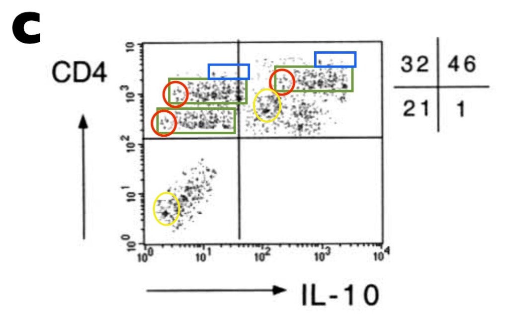
Moving on to Figure 5 which almost looks like it might have been generated from parts shown in Figures 2 to 4, such as the pink, red, light orange, and blue groups of events.

You can read my concerns about this paper here on PubPeer.
Additional papers with concerns
The first author of the paper discussed above has written some other articles that were honored with posts on PubPeer.
These papers span this author’s career from working as a PostDoc in a lab at the Department of Pediatrics at Stanford University School of Medicine, then becoming an Assistant Professor at Harvard Medical School, and his Professor position at the University of Southern California.
Several pseudonymous users, including Bolboschoenus Maritimus, Hoya Camphorifolia, Pandanus Discostigma, and Rhagovelia Zela raised concerns about these papers. Some of these concerns were posted more than two years ago.

Here are the additional papers, in chronological order:
- Akbari O et al. Pulmonary dendritic cells producing IL-10 mediate tolerance induced by respiratory exposure to antigen. Nature Immunology (2001). DOI: 10.1038/90667. [PubPeer link]
- Akbari O et al. Essential role of NKT cells producing IL-4 and IL-13 in the development of allergen-induced airway hyperreactivity. Nature Medicine (2003). DOI: 10.1038/nm851. [PubPeer link]
- Stock P et al. Induction of T helper type 1–like regulatory cells that express Foxp3 and protect against airway hyper-reactivity. Nature Immunology (2004). DOI: 10.1038/ni1122. [PubPeer link]
- Stock P et al. CD8(+) T cells regulate immune responses in a murine model of allergen-induced sensitization and airway inflammation. European Journal of Immunology (2004). DOI: 10.1002/eji.200324623. [PubPeer link]
- Maazi H et al. Lack of PD-L1 expression by iNKT cells improves the course of influenza A infection. PloS one (2013). DOI: 10.1371/journal.pone.0059599. [PubPeer link]
- Maazi H et al. ICOS:ICOS-ligand interaction is required for type 2 innate lymphoid cell function, homeostasis, and induction of airway hyperreactivity. Immunity (2015). DOI: 10.1016/j.immuni.2015.02.007. [PubPeer link]


You have written in your twitter account about noise in XRD and FTIR. The fundamental quantity which is important in any recording of measurements or plots is the Signal/Noise ratio. This should be maximum , meaning noise should be very low as it is in the denominator. This problem in XRD is very much there. Thermogravimetry is another area esp DSC measurements where once has to do measurement in cycles, meaning number of times repeating the measurements . In Diffrential Scanning Calorimetry , the errors are huge. Error analysis has to be reported . Nobody does error analysis now. If you insist on error analysis etc you are dubbed slow and you loose your job. Journals should insist on Signal/ Noise ratio details.
Infact , modelling of climate science plots which were very crowded went through great scrutiny for years for signal/noise ratio. Here is Professor Tim Palmer explaining in one line about Signal/Noise ratio to Sabine Hossenfelder
LINK REMOVED BY MODERATOR
Please ignore the title in utube . It is actually did they underpredict.
LikeLike
Sorry for putting this here, Elisabeth, but I don’t have Twitter. You asked a question about FTIR spectral similarity on the 22nd of November (2.52 pm Tweet), specifically focusing on the far left part of the spectrum. I assume you meant the similarity in the 4000-3700 cm-1 range.
I am a bit surprised that so few who responded knew this, but yes, this similarity is to be expected. The signal in this range is the absorbance of water vapor (you can find a good spectrum of water vapor in the NIST webbook – webbook.nist.gov). The magnitude of these bands can change considerably during the day or between days, as they depend on the humidity during the day and how well the instrument is purged (and with what, ‘dry’ air or nitrogen or the like). I can also see a CO2 absorbance signal – the two little bumbs around 2300 cm-1.
LikeLike
Thank you, Marco! I also would not have flagged this graph as problematic, but I was getting some questions by other readers, who asked me to post it on Twitter. I very much appreciate your answer, and this helps me to know better during my scan of papers that are a bit outside of my own background. Thanks a lot! Elisabeth.
LikeLike
you are right
LikeLike
Dear eliesbik,
I know that you think you are doing a great service to science, but I will tell you that you internet vigilantes are doing quite the opposite and make it very difficult for those who legitimately do this work. When allegations are posted publicly online before the appropriate parties are informed (funding agencies, relevant institutions, etc.) data suddenly goes “missing”, making it often impossible for a legitimate finding of misconduct to be made. You and your type may complain that Universities are not doing their job, but online vigilantyism makes it almost impossible for them to do so. You be serving science much more effectively by going through the appropriate channels instead of trying to make a name for yourself.
LikeLike