One of my recent investigations led me to expand my set of figure types to look at. For our 2016 mBio study, in which I scanned >20,000 papers for image duplication, I focused on real photos of Western blots, agarose gels, tissue sections, etc.
My scans also included flow cytometry images, since these consists of thousands of individual dots that will land at a slightly different and unique place, even if the experiment gets repeated. So if two flow cytometry images, or parts of those images, are identical, that is unexpected, and I might flag these as image duplications.

In my searches I had not really looked at other figures in biomedical papers, such as line graphs. It is hard for me to compare line or bar graphs since they all look very similar. And if they are smoothened, it is very hard to tell if two graphs within the same paper or between two papers are the same. In addition, line graphs are easy to manipulate behind your computer without the reader being able to tell.

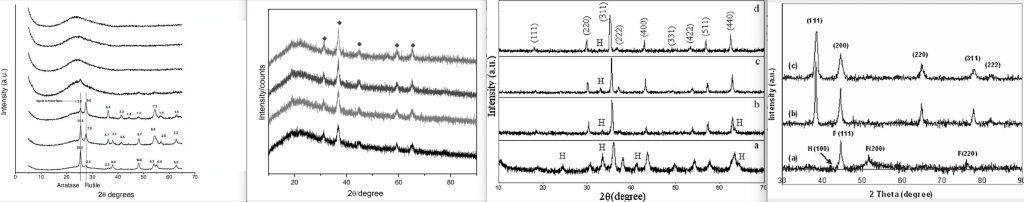
But recently I noticed that some line graphs might be easier to tell apart – and easier to tell if they are unexpectedly similar. As I was looking at a set of papers in the field of nanoparticles, I noticed that these papers often contained certain types of line graphs with a lot of detail. These plots look a bit like earthquake measurements, with a lot of tremors, and every plot looked unique. That makes them easier to compare to each other, and to tell them apart or not.
One type of graph that had that amount of detail that you can tell them apart are XRD plots. XRD stands for “X-ray diffraction”, and it is a technique to analyze the structure of a crystal and its arrangement of atoms. The details of this method are obviously way outside of my scope of knowledge, but Barbara L Dutrow from Louisiana State University and Christine M. Clark from Eastern Michigan University wrote an explanation here.
In short, the crystal is bombarded with X-rays in different angles in a rotating machine, and the intensity of the reflected rays gets continuously measured. At certain angles that are specific for certain crystal structures, the rays get reflected. The results of these measurements are displayed as a spectrum that plots the angle of the X-rays (X-axis) vs. the intensity of the reflected signal (Y-axis). The position of the peaks in this spectrum will tell the user the structure and dimensions of a crystal (I hope I got this right hahaha).
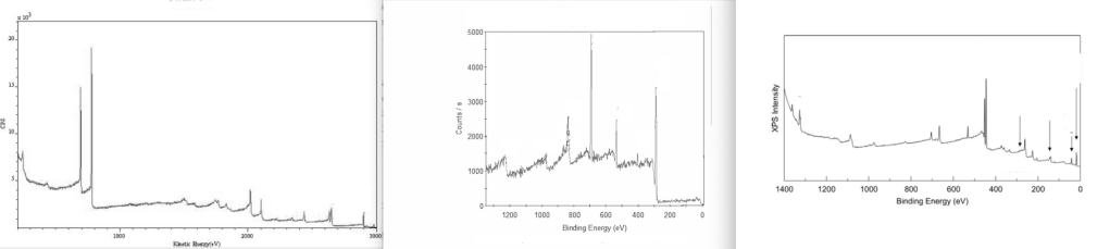
Another type of spectra that research papers on nanoparticles often contain is XPS plots. XPS stands for “X-ray photoelectron spectroscopy”. Here, the chemical composition of the surface of a material can be analyzed. XPS plots show peaks that are characteristic for certain elements, and it will tell the user which elements are present in the surface layer of an unknown material.
XPS plots are somewhat similar to XRD plots in that they show characteristic peaks separated by “noise” measurements.
Obviously, if two materials are very similar in structure and composition, the peaks in their XRD or XPS plots will fall at the same position, and two plots might look very similar at first glance. However, the noise in between the peaks should look different.
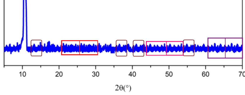
Here is a graph taken from a PLOS ONE article with four XRD plots, each from a nanoparticle baked at a different temperature, to illustrate this. The structure and composition of these nanoparticles are expected to be very similar.
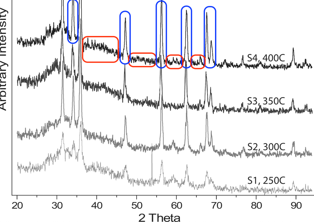
I have marked the peaks on the top graph in blue. All four spectra look very similar to each other if you just look at the peaks. That is expected because they have the same composition.
But in between the peaks there are regions where no reflection was measured. Here you will see what is called “noise”, just the tremble of the background measurement. I have marked some of those regions in red. The noise parts of the 4 graphs all are different. So, even though the four graphs look similar to each other at first glance, each graph is unique in the noise parts.
However, I am not an expert in crystallography, XRD, or XPS. Maybe I am wrong here. So my question is: would one expect the noise parts of these types of plots to look exactly the same, even if the same crystal was measured twice? If you are an expert, please let me know in the comments!
For now, based on the plot above, and many others that I found online (see here, here, and here) I will assume that the noise parts of these plots should never look the same.
Although most XRD and XPS plots in the biochemical literature appear to be unique, some others are remarkably similar. Here are some PubPeer entries questioning the unexpected identity of such plots.
- Macroscopic and Microscopic Investigation of U(VI) and Eu(III) Adsorption on Carbonaceous Nanofibers
- Direct Z-Scheme heterojunction nanocomposite for the enhanced solar H2 production
- Controlled synthesis of pentachlorophenol-imprinted polymers on the surface of magnetic graphene oxide for highly selective adsorption
- Synthesis of a monodisperse well-defined core–shell magnetic molecularly-imprinted polymer prior to LC-MS/MS for fast and sensitive determination of mycotoxin residues in rice
- Synthesis of silver nanoparticles using A. indicum leaf extract and their antibacterial activity (retracted)
In some cases there is even apparent repetition within the same plot. Here is an example of some unexpected noise stutter, as marked by a pseudonymous PubPeer user.
Smut Clyde (pseudonym) has found many of those noise stutter examples, where plots appear to be composed of repeating parts. For example, read Smut’s article called “Nanodandruff and synthetic spectroscopy” on Leonid’s blog For Better Science.
Some more examples of unexpected repeats within spectra plots can be found on PubPeer:
- Highly concentrated amino group-functionalized graphite encapsulated magnetic nanoparticles fabricated by a one-step arc discharge method
- Spectroscopic and Modeling Investigation of Eu(III)/U(VI) Sorption on Nanomagnetite from Aqueous Solutions
- Characterization of radioactive cobalt on graphene oxide by macroscopic and spectroscopic techniques
Let me know what you think about these unexpected repeats in the comments below. Do you think these repeats can occur by chance?


I’m a solid state chemist, so I use PXRD daily. I won’t comment on the particular figures, but I will make some general comments.
The noise in PXRD patterns* arises from simple poisson statistics: the detector counts the number of X-rays at each point and this will have a standard error of square root(no. of X-rays). It is outrageously unlikely that the same noise pattern can emerge in multiple data sets, even if measured on the same sample immediately after.
Your description of the meaning of PXRD was pretty good – but one minor additional point: the position of the peak tells you about the size of the repeat unit in the crystal (as you said), but it’s the *intensity* that tells you where the atoms are.
*typically, XRD data is measured using constant X-ray wavelength and so are properly patterns, not spectra.
LikeLike
My scans also included flow cytometry images, since these consists of thousands of individual dots that will land at a slightly different and unique place, even if the experiment gets repeated.
Not to forget the flow-cytometry histograms, with only one measurement of each cell, instead of a two-dimensional scatter-plot.
There are photoshop-assembled FTIR spectra out there in the literature too.
LikeLike